Scratonicity - Part 1

An initial exploration of dialogue from The Office

R
The Office
EDA
Text Analysis
Published

March 14, 2020

I Just Want to Lie on the Beach and Eat Hog Dogs

Who doesn’t love The Office? I went through high school and college following the on-again off-again romance of Jim and Pam, the Icarus-esque ascendancy and fall of Ryan the Temp, and the perpetual cringey-ness of Michael Scott. And aside from that handful of people who fled the room in a cold panic at even the mention of “Scott’s Tots,” I think this was probably true for most of my generation. You’d be hard pressed to go to a Halloween party in the late aughts without seeing someone dressed in the tan-and-yellow palette of Dwight Schrute, and before the modern era of Netflix and Hulu, we regularly set aside Thursday nights to tune into NBC.

And although I was a big Office fan several years ago, I haven’t thought too too much about it recently – at least until I stumbled across the release of the {schrute} package recently. {schrute} is an R package with one purpose – presenting the entire transcripts of The Office in tibble format, making the dialogue of the show much easier to analyze. I played around with the package and a quick sentiment analysis back in December when I looked at the sentiments expressed by Jim and Pam over the course of the series:

There’s a ton more we can do with the package, though, and with the transcripts available and in a clean format, plus all of the tools R has available for text analysis, I figured I’d do a mini-series of blog posts analyzing some of the data. The plan (as of now) is to start this first post with some exploratory analyses and visualizations, then move into some other types of modeling in later posts. I’ll also include all of my code throughout.


As a quick aside, a lot of the text analyses I’m going to work through in this first post come from the Text Mining with R book by Julia Silge and David Robinson. I’d strongly recommend this to anyone looking to dive into analyzing text data.

Setup

First, let’s read in the data. I’m also going to limit the data to the first seven seasons, which spans the “Michael Scott” era. Not only because these are the best seasons (which they undoubtedly are), but also because doing so eliminates a major confounding factor (i.e. Steve Carell leaving the show) from the analysis.

office <- theoffice %>%
  filter(as.numeric(season) <= 7)

glimpse(office)
Rows: 41,348
Columns: 12
$ index            <int> 1, 2, 3, 4, 5, 6, 7, 8, 9, 10, 11, 12, 13, 14, 15, 16…
$ season           <int> 1, 1, 1, 1, 1, 1, 1, 1, 1, 1, 1, 1, 1, 1, 1, 1, 1, 1,…
$ episode          <int> 1, 1, 1, 1, 1, 1, 1, 1, 1, 1, 1, 1, 1, 1, 1, 1, 1, 1,…
$ episode_name     <chr> "Pilot", "Pilot", "Pilot", "Pilot", "Pilot", "Pilot",…
$ director         <chr> "Ken Kwapis", "Ken Kwapis", "Ken Kwapis", "Ken Kwapis…
$ writer           <chr> "Ricky Gervais;Stephen Merchant;Greg Daniels", "Ricky…
$ character        <chr> "Michael", "Jim", "Michael", "Jim", "Michael", "Micha…
$ text             <chr> "All right Jim. Your quarterlies look very good. How …
$ text_w_direction <chr> "All right Jim. Your quarterlies look very good. How …
$ imdb_rating      <dbl> 7.6, 7.6, 7.6, 7.6, 7.6, 7.6, 7.6, 7.6, 7.6, 7.6, 7.6…
$ total_votes      <int> 3706, 3706, 3706, 3706, 3706, 3706, 3706, 3706, 3706,…
$ air_date         <fct> 2005-03-24, 2005-03-24, 2005-03-24, 2005-03-24, 2005-…

Just to check that the data we have matches what we’re expecting, let’s take a look at which seasons we have, plus how many episodes we have per season.

office %>%
  distinct(season, episode) %>%
  count(season, name = "num_episodes")
# A tibble: 7 × 2
  season num_episodes
   <int>        <int>
1      1            6
2      2           22
3      3           23
4      4           14
5      5           26
6      6           24
7      7           24

This generally matches what Wikipedia is telling me once we account for two-part episodes, and we can see that we only have the first seven seasons.

Me think, why waste time say lot word, when few word do trick

A few questions we can ask here involve how much/how often different characters speak. Probably the most basic question is: who has the most lines?

top_20_chars <- office %>%
  count(character, sort = TRUE) %>%
  top_n(20) %>%
  pull(character)
office %>%
  filter(is.element(character, top_20_chars)) %>%
  count(character, sort = TRUE) %>%
  ggplot(aes(x = fct_reorder(character, n), y = n)) +
  geom_col(fill = purple) +
  labs(
    x = "",
    y = "Number of Lines",
    title = "Who Has the Most Lines?"
  ) +
  coord_flip()

It’s not surprising to me that Michael has the most lines, but the magnitude of the difference between him and Dwight is a bit surprising.

What if we look at the number of lines per season?

office %>%
  filter(is.element(character, top_20_chars)) %>%
  count(character, season, sort = TRUE) %>%
  ggplot(aes(x = as.numeric(season), y = n, color = character)) +
    geom_line() +
    geom_point()

This isn’t terribly informative – let’s go back to our bar graph.

office %>%
  filter(is.element(character, top_20_chars)) %>%
  count(character, season, sort = TRUE) %>%
  group_by(season) %>%
  top_n(n = 5) %>%
  ungroup() %>%
  ggplot(aes(x = fct_reorder(character, n), y = n)) +
    geom_col(fill = purple) +
    coord_flip() +
    facet_wrap(~season, scales = "free") +
    labs(
      title = "Number of Lines by Season",
      x = "",
      y = ""
    ) +
    theme_minimal()

Again, not surprising that Michael has the most lines across all seasons. Dwight, Jim, and Pam are always the next three, but the orders change a bit between seasons. The fifth spot is where we see some movement, with Oscar and Jan sneaking in before Andy joins the show in Season 3. And check out Ryan in S4!

Sometimes I’ll start a sentence and I don’t even know where it’s going

So, above, we just looked at the number of lines each character had. Another option is to do some analyses at the word level. For instance, we can look at patterns of word usage for individual characters, between characters, and over time.

To start with this, I’m going to restructure the data so we have one word per row in our tibble. I’m also going to remove “stop words” (e.g. “a,” “the,” “at”), since these will show up a lot but (for our purposes) aren’t actually all that meaningful:

office_words <- office %>%
  unnest_tokens(word, text) %>%
  anti_join(stop_words)
glimpse(office_words)
Rows: 125,040
Columns: 12
$ index            <int> 1, 1, 1, 2, 2, 3, 3, 3, 4, 4, 6, 6, 6, 6, 6, 6, 6, 6,…
$ season           <int> 1, 1, 1, 1, 1, 1, 1, 1, 1, 1, 1, 1, 1, 1, 1, 1, 1, 1,…
$ episode          <int> 1, 1, 1, 1, 1, 1, 1, 1, 1, 1, 1, 1, 1, 1, 1, 1, 1, 1,…
$ episode_name     <chr> "Pilot", "Pilot", "Pilot", "Pilot", "Pilot", "Pilot",…
$ director         <chr> "Ken Kwapis", "Ken Kwapis", "Ken Kwapis", "Ken Kwapis…
$ writer           <chr> "Ricky Gervais;Stephen Merchant;Greg Daniels", "Ricky…
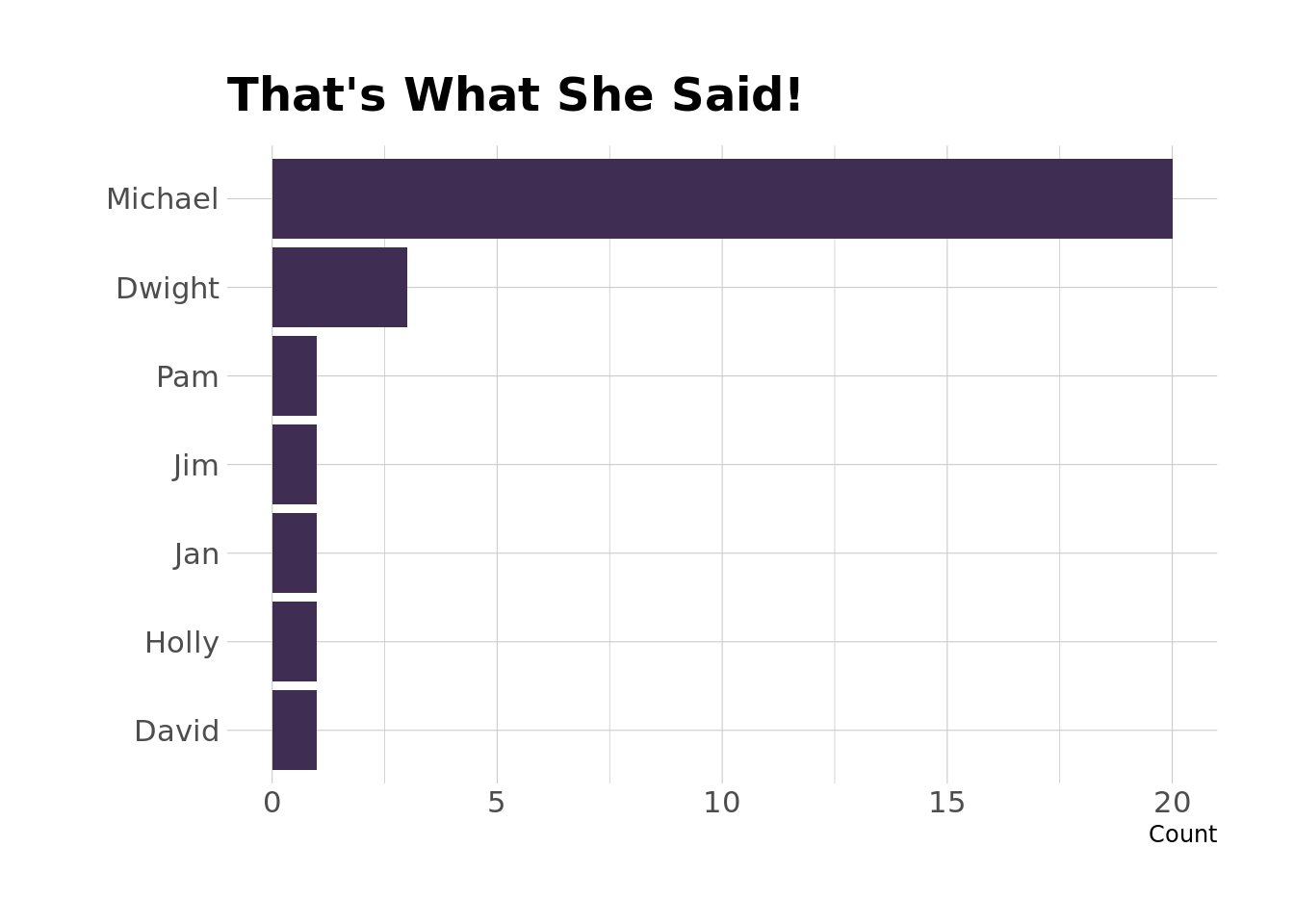
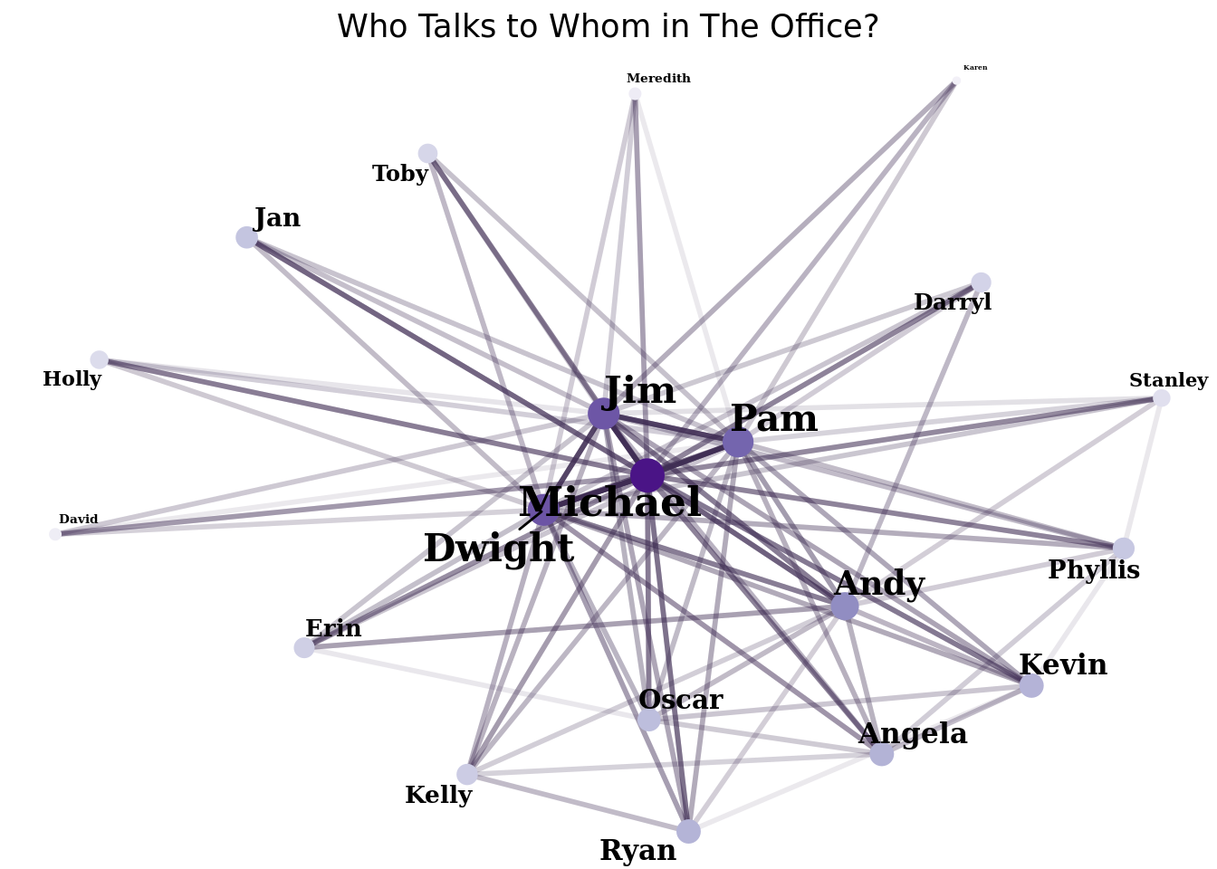
$ character        <chr> "Michael", "Michael", "Michael", "Jim", "Jim", "Micha…
$ text_w_direction <chr> "All right Jim. Your quarterlies look very good. How …
$ imdb_rating      <dbl> 7.6, 7.6, 7.6, 7.6, 7.6, 7.6, 7.6, 7.6, 7.6, 7.6, 7.6…
$ total_votes      <int> 3706, 3706, 3706, 3706, 3706, 3706, 3706, 3706, 3706,…
$ air_date         <fct> 2005-03-24, 2005-03-24, 2005-03-24, 2005-03-24, 2005-…
$ word             <chr> "jim", "quarterlies", "library", "told", "close", "ma…

We can see that we have a new column, word, with one word per row. We can also see that the only words in the first line of dialogue (All right Jim. Your quarterlies look very good. How are things at the library?) that make it through the stop words filter are jim, quarterlies, and library. We could fiddle with the stop words list if we wanted to keep words like “good” or “things,” but I’m not too concerned about that for now.

As a first pass, let’s take a look at our 20 characters with the most lines of dialogue and see what each character’s most commonly-used word is:

office_words %>%
  filter(is.element(character, top_20_chars)) %>%
  count(character, word, sort = TRUE) %>%
  group_by(character) %>%
  top_n(n = 1) %>%
  kable(format = "html") %>%
  kable_styling(bootstrap_options = c("striped", "condensed", "hover"))
character word n
Michael yeah 563
Dwight michael 280
Jim yeah 274
Pam michael 257
Jan michael 159
Andy yeah 138
Kevin yeah 79
David michael 67
Ryan yeah 66
Oscar michael 65
Phyllis michael 59
Toby michael 50
Darryl na 48
Kelly god 44
Angela dwight 40
Holly yeah 39
Erin michael 37
Karen yeah 28
Stanley michael 27
Meredith wait 22

So, that’s not great. We can see that our stop words didn’t pick up “yeah.” One way around this would be to filter out additional words like “yeah,” “hey,” etc. that aren’t in our stop words list. But we’ll probably still leave out some common words that we might not want to show up in our exploration. A better approach is probably to use the tf-idf statistics (term frequency-inverse document frequency), which adjusts the weight a term is given in the analysis for each character by how commonly the word is used by all characters, with more common words getting lower weights. Essentially, this lets us figure out which words are important/unique to each of our characters.

office_words %>%
  filter(is.element(character, top_20_chars)) %>%
  count(character, word, sort = TRUE) %>%
  bind_tf_idf(word, character, n) %>%
  group_by(character) %>%
  top_n(n = 5, wt = tf_idf) %>%
  slice(1:5) %>%
  ungroup() %>%
  ggplot() +
    geom_col(aes(x = reorder_within(word, tf_idf, within = character), y = tf_idf), fill = purple) +
    facet_wrap(~character, scales = "free") +
    coord_flip() +
    scale_x_reordered() +
    theme_minimal() +
    labs(
      x = "",
      y = "",
      title = "Which Words are Important to Which Characters?"
    ) +
    theme(
      axis.text.x = element_blank()
    )

This looks right – we see that “tuna” and “nard” are important to Andy, which totally makes sense. Some other gems in here are “wuphf” for Ryan, “wimowheh” for Jim, and “awesome” for Kevin.

Next, let’s take a closer look at how Michael’s speech compares to some of the other main characters – Dwight, Jim, and Pam. We’ll also leave Kelly in here because I think she’ll be interesting to compare to Michael.

main_char_words <-  office_words %>%
  filter(character %in% c("Michael", "Dwight", "Jim", "Pam", "Kelly"),
         str_detect(word, "\\d+", negate = TRUE)) %>%
  count(character, word) %>%
  group_by(character) %>%
  mutate(word_prop = n/sum(n)) %>%
  ungroup() %>%
  select(-n) %>%
  pivot_wider(names_from = character,
              values_from = word_prop)
char_plot <- function(df, char) {
  df %>%
  select(word, Michael, {{char}}) %>%
  mutate(color = log(abs(Michael-{{char}}))) %>%
  ggplot(aes(y = Michael, x = {{char}})) +
    geom_text(aes(label = word, color = color), check_overlap = TRUE, vjust = 1) +
    geom_abline(color = "grey50", lty = 2) +
    scale_x_log10(labels = scales::percent_format()) +
    scale_y_log10(labels = scales::percent_format()) +
    scale_color_distiller(
      type = "seq",
      palette = "Purples",
      direction = 1
    ) +
    theme_minimal() +
    theme(
      legend.position = "none"
    )
}
main_char_words %>%
  char_plot(Dwight)

Ok, so let’s walk through how to read this. For a given word, the y-axis shows how frequently Michael uses that word, and the x-axis shows how frequently Dwight uses that word. The diagonal dotted line represents equal usage – words that appear on or close to the line are words that Michael and Dwight use about as frequently as one another. Words above the line are those that Michael uses more; words below the line are those that Dwight uses more. Words closer to the line will appear lighter in the graph, whereas words farther way will have more color. So, looking at the graph, we can see that Dwight and Michael both say “hey” pretty often and use the word more or less equally. Dwight says “Mose” way more often than Michael does (because it’s farther from the line), whereas Michael says “Scott” more often than Dwight.

Let’s take a look at what these graphs look like for Jim and Pam

main_char_words %>%
  char_plot(Jim)

main_char_words %>%
  char_plot(Pam)

Aand let’s throw Kelly in there too because it might be interesting.

main_char_words %>%
  char_plot(Kelly)

What we see here is that, at least when compared to Michael, Kelly’s speech is pretty idiosyncratic – there are lots of words (“blah”, “bitch”, “god”) that she uses waaaayy more frequently than Michael does.

And finally (for this section), I would be remiss if I made it through an analysis of how characters from The Office speak without giving a “that’s what she said” tally…

office %>%
  filter(str_detect(text, "what she said")) %>%
  count(character) %>%
  ggplot(aes(x = fct_reorder(character, n), y = n)) +
    geom_col(fill = purple) +
    labs(
      x = "",
      y = "Count",
      title = "That's What She Said!"
    ) +
    coord_flip()

Not at all a surprise….

Identity theft is not a joke, Jim!

Finally, I want to visualize who characters talk to. To do this, I’m going to put together a network plot showing links between characters based on how frequently they interact.

set.seed(0408)
office_links <- office %>%
  filter(character %in% top_20_chars) %>%
  group_by(episode) %>%
  mutate(to = lead(character)) %>%
  ungroup() %>%
  rename(from = character) %>%
  count(from, to) %>%
  filter(from != to,
         !is.na(to),
         n > 25)
office_verts <- office_links %>%
  group_by(from) %>%
  summarize(size = log(sum(n), base = 2)) %>%
  ungroup()
network_graph <- graph_from_data_frame(office_links, vertices = office_verts)
network_graph %>%
  ggraph(layout = "igraph", algorithm = "fr") +
  geom_edge_link(aes(edge_alpha = n^.5), color = purple, edge_width = 1) +
  geom_node_point(aes(size = size, color = size)) +
  geom_node_text(aes(label = name, size = size), repel = TRUE, family = "Garamond", fontface = "bold") +
  scale_color_distiller(
      type = "seq",
      palette = "Purples",
      direction = 1
    ) +
  labs(
    title = "Who Talks to Whom in The Office?"
  ) +
  theme_void() +
  theme(
    legend.position = "none",
    plot.title = element_text(hjust = .5)
  )

The network graph shows links between characters. The size and color of the node (point) associated with a person corresponds to the the total number of interactions they have, with larger and purple-r nodes representing more interactions. The color of the link between characters also corresponds to the number of interactions between two characters, with darker purple links representing more interactions and lighter links representing fewer interactions. Also, characters with more total interactions are sorted toward the center of the network, which is where we see Michael, Jim, Pam, and Dwight. Finally, interactions are only shown if characters have more than 25 total interactions (this prevents the graph from showing a jillion lines).

I’m going to wrap this one up here, but later on I’ll probably play around a bit with doing some statistical modeling – predicting who is speaking, who a character is speaking to, something like that.

Reuse

Citation

BibTeX citation:
@online{ekholm2020,
  author = {Ekholm, Eric},
  title = {Scratonicity - {Part} 1},
  date = {2020-03-14},
  url = {https://www.ericekholm.com/posts/scrantonicity-part-1},
  langid = {en}
}
For attribution, please cite this work as:
Ekholm, Eric. 2020. “Scratonicity - Part 1.” March 14, 2020. https://www.ericekholm.com/posts/scrantonicity-part-1.